One of my favorite bloggers, House of Hepworths, recently added a cool graphic with her interior paint colors.
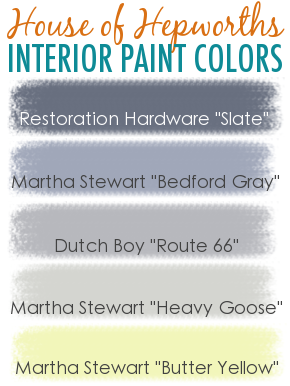 |
| Source: Sidebar from House of Hepworths. NOTE: Please ignore the above pin if you like this and pin from the House of Hepworth's site. Thankyouverymuch. |
I liked the way it looks, and we are often asked about our paint selections. Our original paint post was done before our house was painted, so it was time for an update. First, here is a look at all of our colors together:

As you can see, we mostly stayed with gray tones. For our four-year-old's bedroom and bathroom, we used more vivid colors.
Here's a look at how these colors look in context.
I love purple. It's been my favorite color for as long as I could remember. It's the color of my favorite football team (Skol Vikings!) and our wedding colors were platinum and plum. When Niels said it would be fine with a purple bedroom, I was thrilled. We settled on this grayish-purple, with a very fitting bedroom name:

In addition to our master bedroom, we also used Sensuous Gray in our bathroom's water closet. I've included larger color samples, along with the grid so readers can easily find the correct card at their local Sherwin Williams store. We're considering one of the two darker shades for our front door once the weather warms up.

We knew we wanted a greenish-gray kitchen as soon as we fell in love with our backsplash tile.

In addition to our kitchen, we used Oyster Bay in our in-law suite, pantry, dinette, and both laundry rooms.

We knew we wanted a darker, more dramatic gray to provide contrast to our lighter, more neutral gray.

We used Dovetail in our guest room, office, and master bathroom.

In our old house, we used a standard beige colors. We knew we wanted to go with gray neutrals in our new house, and Mindful Gray fit the bill perfectly.


At the time we were selecting our paint colors, our then two-and-a-half-year-old loved yellow and begged for a yellow room. We were able to compromise with a yellow closet and bathroom. I was torn between using Solaria or Sensuous Gray for the powder room, but we opted for yellow to better go with our Dutch theme. Of all the colors, Solaria has the most variance over the course of the day. It's rarely as buttery as it looks in the photo on the left below. In our powder room, with its large window, it can look anything from very pale, almost white, to dark, nearly neon. The photo on the right below is a good compromise of all the shades it shows.


I am happy that we were able to convince D to go with a blue room because it is his new favorite color. We chose Scanda because it was bright, fun, matched his new train sheets, and was not yellow.


Linked to:
Print this post
Does the Mindful Gray appear greenish? It looks green in your pic of the room but gray on the card. Thanks!
ReplyDeleteHi, did you use the Emerald line of SW paint? Did you use a Flat or Satin finish throughout the house? Thanks!
ReplyDelete