Showing posts with label paint. Show all posts

Thursday, August 29, 2013

Our purple door


I grew up in Minnesota, home of the Vikings, the mighty Purple People Eaters of my childhood years. Football was a big family affair when I was growing up, so I suppose it's no surprise the purple  has been my favorite color for as long as I can remember. 

When Niels and I started brainstorming our wishlist for the dream house. One of the aesthetic items on my list was a purple front door. Niels was on board after we say this gray house in our city which served as inspiration in many ways. (We introduced ourselves to the owners so they wouldn't be freaked out by all our drive-bys!)


When we were building the house, we left the front door white, in part because I couldn't decide on the right purple. I wanted it to be dark with more gray tones than blue. It also needed to work with the stone on our house. 

As summer turns to fall, we felt the pressure to get the door painted before winter. We landed on Quixotic Plum from Sherwin Williams. (For those who prefer Benjamin Moore paints,Shadow is the closest match).
Thanks to Google and Pinterest I found this house on Spruce Interiors and was sold.

SW quixotic plum for the front door

 Dirty Diaper Laundry also uses Quixotic Purple, but included the sidelights as well.

After looking at the above photo, I decided I wanted to keep the white trim to provide a little contrast and to blend with the white trim piece above our door. I used Sherwin Williams Color Visualizer to confirm that I liked this idea better than covering the entire door with the purple paint. I did, so I printed off the photo, and then accidentally deleted the picture. Oops. At least, I'm more than happy with the real thing!

When the painter arrived, I showed him the picture and got right to work. 

I am so happy with the color. Choosing paint was the hardest part of the whole build process for us, and it's so hard to determine what a little chip will look like on a bigger scale, but I loved the color and am so happy that we kept the trim white. 


Voila! Our new purple door!

It's really interesting how the color changes depending on the time of day and how cloudy it is. At times it looks nearly black from the road.

Bye bye white...hello purple!


Updated:
Over Labor Day weekend, Niels and I cleaned out our garage and were so happy to find our long lost name plate. 


This was a wedding gift from Niels' family. We had it up at our old house, took it down when we listed that house for sale, and it was packed in a box...with lawn care items. Ahem. 

We put it up with Command Strips, and so far it's holding up really well. We also splurged on a new welcome mat. 

Front porch: done!

Linked to:
30 Homemade Days * DIY ShowoffHouse of Hepworths * Liz Marie BlogPractically Functional * And Sew We CraftSew Much CraftingTatertots & Jello * Thrifty Decor Chick

Sunday, April 14, 2013

Master Bedroom Reveal

Yesterday morning I took a bunch of photos of our bedroom. We have a housekeeper who comes every other week to clean the bathrooms, kitchen, and floors. (Yes, I am capable of cleaning my own house, but living with a brain injury means I have less energy each day. It is worth it to us to use my limited energy enjoying time with my family, cooking, exercising, and doing fun projects that also keep my brain sharp-ish rather than cleaning). That said, Kim was here on Friday, and on Saturday morning, our room was so pretty, I decided it was time to post the reveal.


Part of the reason I procrastinated about posting this reveal is that in the 5.5 years we've been married, we've never had a headboard so our room only looked  nearly finished. We've been looking off and on for the last, um, 5.5 years for one, but we didn't really want to spend hundreds of dollars for a headboard, even though that seems to be the going rate for a king size padded leather one.

So, yesterday, I was out running some errands and low and behold, I found this beauty for a song.

There's a teeny tiny scratch that you won't see because I won't point it out to you. But it was cause for the store to practically give it away! (I suspect the staff had a contest to see who could unload it that day!)

So, after re-taking the photos, I am ready for the reveal! Welcome to our master bedroom.


The color is Sherwin Williams Sensuous Gray. It's a nice soft grayish-plum. It's very serene. Just what we wanted in our bedroom.


You may notice that our bedroom is smaller that most in a home our size. We didn't want a or sitting area or owner's retreat. Our whole house is our retreat! 

Elements:

After living with the teeny tiny nightstands we used when we staged our old house, we went big with these Ikea Hopen chests. We bought the curtains at Target. It's hard to see, but the stick lamp is from Target, as well. Maybe at some point we'll get larger ones, but for now these are just fine.

Behind each of our nightstands, Niels attached power strips to the wall. One little tweak we would make is to have our outlets installed under the windows instead of on the back wall between the windows. With the power strips we don't have to search for our plugs. My hubby is brilliant. 

We had lots of ideas for above our bed, but I'm so happy we landed on this 11x14 framed photos from our wedding day. I found the frames at one of my favorite discount shops for less than $20. 

Our marriage motto is "No Returns. No exchanges." I bought this vinyl from Uppercase Living, but as soon as I figure out how to use my Silhouette Cameo, I can start making things like this on my own!


Our Insulated Concrete Form (ICF) walls give us nice deep window sills. They can make hanging curtains a challenge, but mini-tension rods work well. 

The bathroom is nearly done, so we'll save that reveal for another day. On the other side of the bathroom door is the "We Do" gallery

On the wall next to the We Do gallery, we put up some Ribba shelves to hold our wedding album and scrapbooks. 

Our big Valentine's Date this year was putting together the Expedit shelf from Ikea. We opted for a bookshelf rather than dresser because our closet is plenty big, and we love our books! Styling it is an ongoing process, but this is what it looks like today. The items on top still need to be hung up, but until we figure out our final design, they are fine to sit on top. 

I LOVE this watercolor that my super talented friend Dave did for us of our late great Bailey dog. (Check out his Etsy shop for more of his work. In addition to custom pet portraits, he also does wonderful landscapes that you can see on his blog).

As you may have guessed if you've been following us for awhile, we like art that is personal to us. We knew we wanted a map of some sort, so when I saw this custom heart map in Breeding Fancy's Etsy Shop, I knew we found what we wanted. She let us choose the colors and specify our hometowns. Love it!

The tulips were held by the youngest attendant at our wedding, our goddaughter. (She was living in China at the time, so we kept the flowers for her). The heart was just a fun project I did with D one day. It serves as a place holder until I find something I love to go in the other silver frame like the one Bailey is in.

I made a few printables for the frames within the bookshelf. This first one was inspired by Craftiments, who was kind enough to provide the background for free on her site.

I designed the other two, which you can save to your computer by right-clicking and saving to your computer. 


This cute little suitcase was the card holder at our wedding.

And these We Do letters were on the cake table of our wedding. I love that we are still using our wedding decor almost six years later. 


Thanks for touring our room!

If you've missed our other reveals, click the links below.
Boy's Bedroom
Guest Bedroom
Flex Room
Kitchen
Pantry
Family Bathroom
Upstairs Laundry Room
Paint Tour

If you'd like to see the images that inspired us, check out out master bed and bath board on Pinterest.

Linked to:
36th Avenue * 52 Mantels * Better with AgeCrystal & Co *  DIY Dreamer * DIY ShowoffFluster Buster * House of HepworthsHousewife How To's Liz Marie * New Nostalgia *  NY Melrose Family * Oh My CreativePursuit of a Functional Home *  SNAPSumo's Sweet Stuff * Taylor House Uncommon Designs * Will Cook for Smiles


Thursday, February 7, 2013

Paint Tour

It's been pretty quiet on the blog this week. I've been down and out with a pretty nasty headache and fatigue the last few days. My brain injury is winning this round, but it won't win the fight.

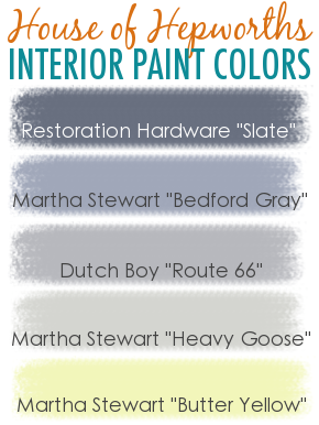
One of my favorite bloggers, House of Hepworths, recently added a cool graphic with her interior paint colors. 
Source: Sidebar from House of Hepworths. NOTE: Please ignore the above pin if you like this and pin from the House of Hepworth's site. Thankyouverymuch.
I liked the way it looks, and we are often asked about our paint selections. Our original paint post was done before our house was painted, so it was time for an update. First, here is a look at all of our colors together:

As you can see, we mostly stayed with gray tones. For our four-year-old's bedroom and bathroom, we used more vivid colors. 

Here's a look at how these colors look in context.

I love purple. It's been my favorite color for as long as I could remember. It's the color of my favorite football team (Skol Vikings!) and our wedding colors were platinum and plum. When Niels said it would be fine with a purple bedroom, I was thrilled. We settled on this grayish-purple, with a very fitting bedroom name:
In addition to our master bedroom, we also used Sensuous Gray in our bathroom's water closet. I've included larger color samples, along with the grid so readers can easily find the correct card at their local Sherwin Williams store. We're considering one of the two darker shades for our front door once the weather warms up.

We knew we wanted a greenish-gray kitchen as soon as we fell in love with our backsplash tile
In addition to our kitchen, we used Oyster Bay in our in-law suite, pantry, dinette, and both laundry rooms.

We knew we wanted a darker, more dramatic gray to provide contrast to our lighter, more neutral gray.
We used Dovetail in our guest room, office, and master bathroom.

In our old house, we used a standard beige colors. We knew we wanted to go with gray neutrals in our new house, and Mindful Gray fit the bill perfectly.
We used Mindful Gray in the great room, mudroom, both master closets, in-law bathroom, foyer, stairway, and upstairs hallway.

At the time we were selecting our paint colors, our then two-and-a-half-year-old loved yellow and begged for a yellow room. We were able to compromise with a yellow closet and bathroom. I was torn between using Solaria or Sensuous Gray for the powder room, but we opted for yellow to better go with our Dutch theme. Of all the colors, Solaria has the most variance over the course of the day. It's rarely as buttery as it looks in the photo on the left below. In our powder room, with its large window, it can look anything from very pale, almost white, to dark, nearly neon. The photo on the right below is a good compromise of all the shades it shows.

I am happy that we were able to convince D to go with a blue room because it is his new favorite color. We chose Scanda because it was bright, fun, matched his new train sheets, and was not yellow.

Linked to:
Related Posts Plugin for WordPress, Blogger...